Luxury Skincare, 2025
AURA
A skincare house built on stone, leaf and a very quiet green.
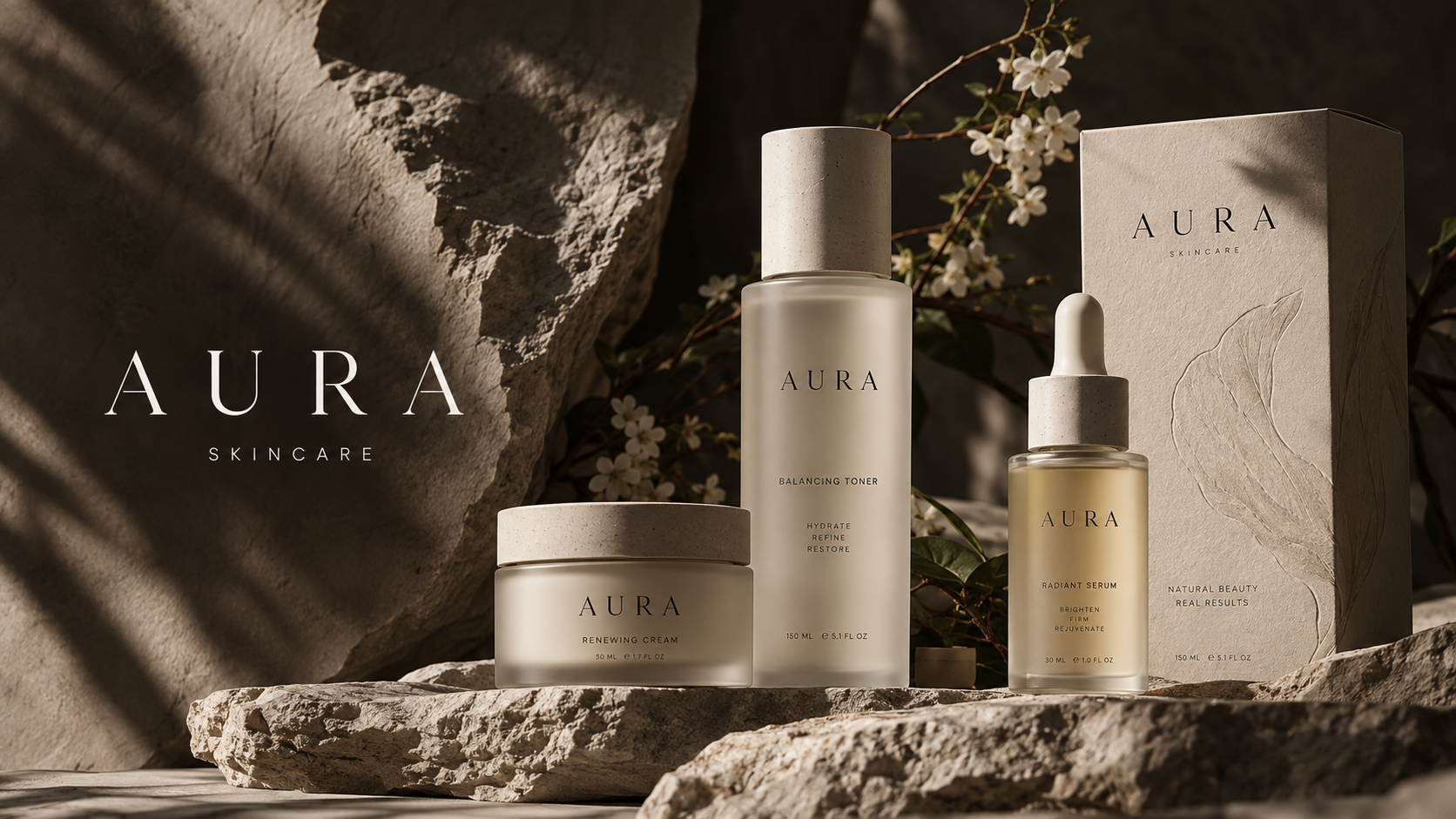
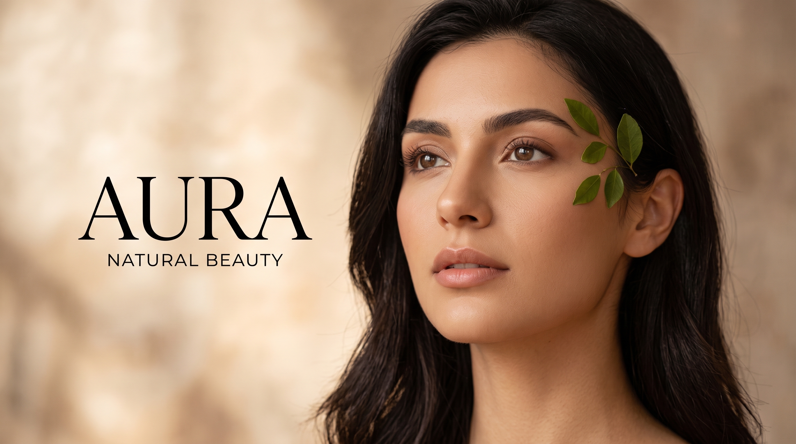
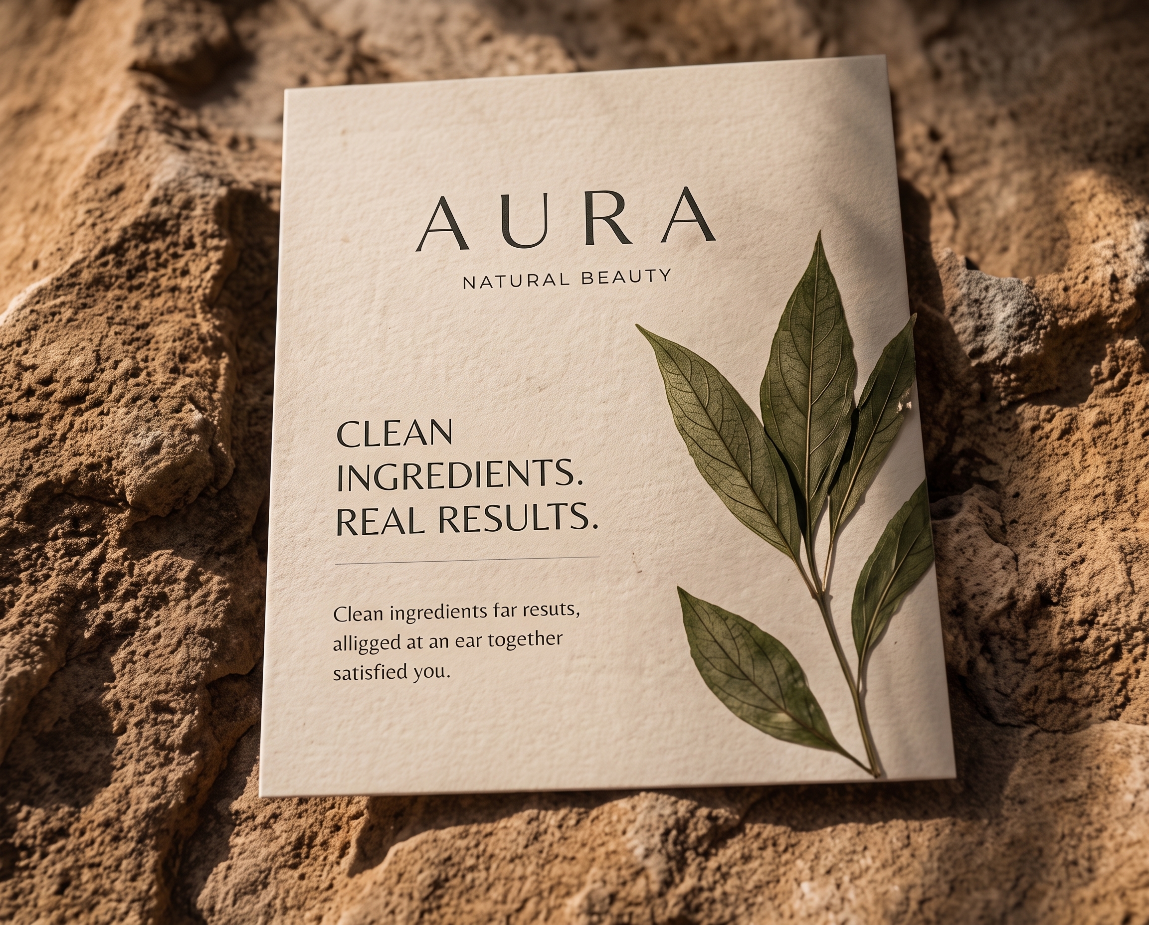
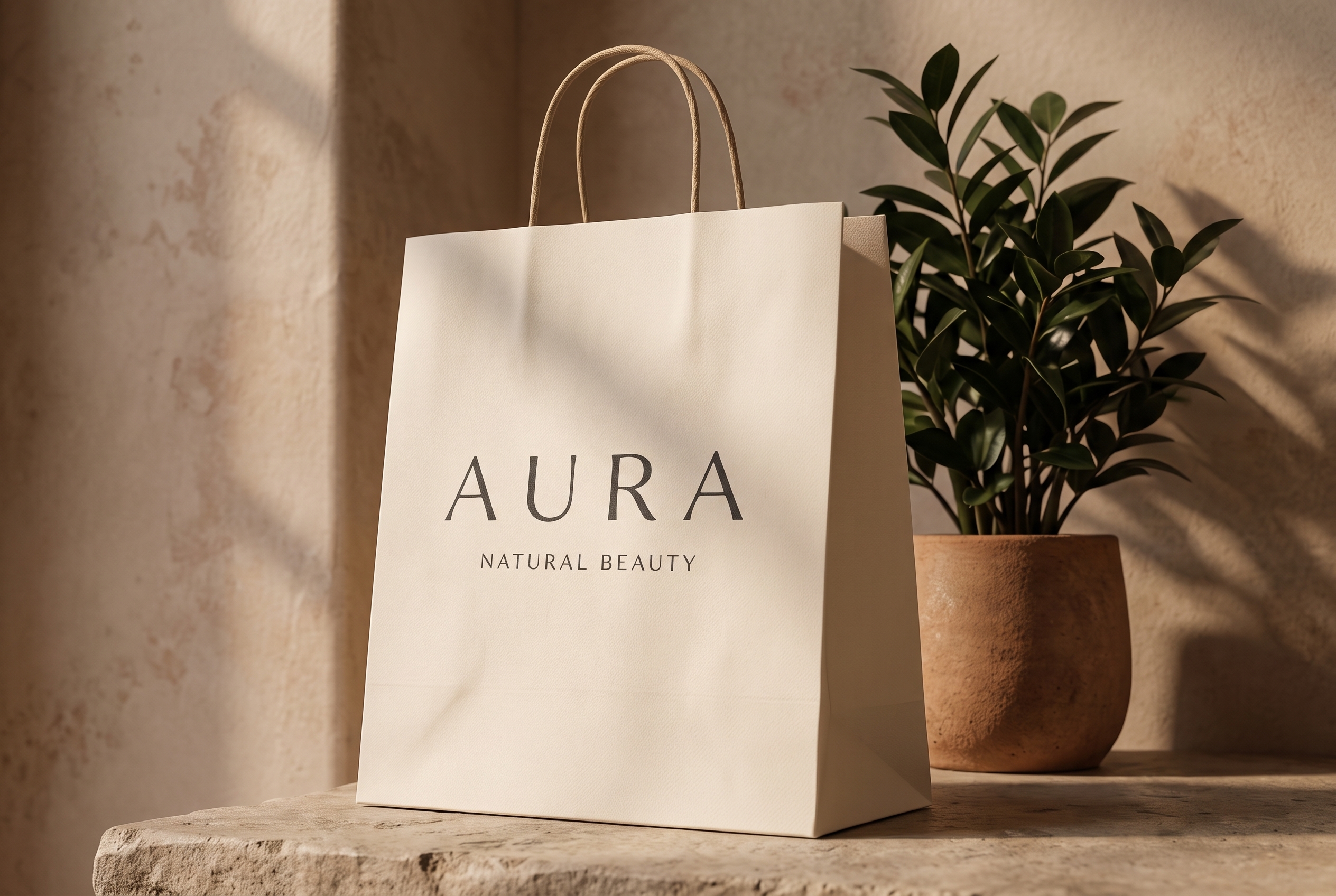
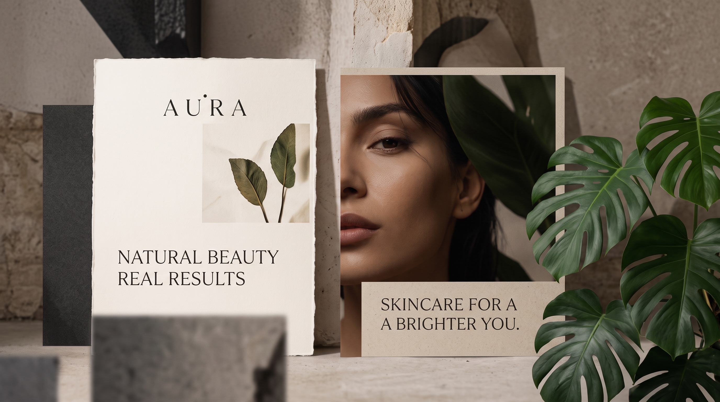
AURA makes clean skincare with a short, almost clinical ingredient list. We gave it the opposite of a clinical look: raw stone, pressed leaves, heavy uncoated paper and a green so deep it reads as black in low light. The wordmark is spaced wide and set small, so the product always speaks first.
What we made
- Wordmark and spacing system
- Colour and material palette
- Bottles, jars and cartons
- Retail bags and printed matter
- Campaign art direction
- Store signage
How we built it
- 01
Two weeks with the founders and the formulas before any drawing began.
- 02
One material board of stone, leaf and paper that every decision was tested against.
- 03
Packaging, print and signage produced together, so the finishes match exactly.
The identity in use