Specialty Coffee, 2024
KIN
A roastery identity that reads from across the street and up close on the bag.
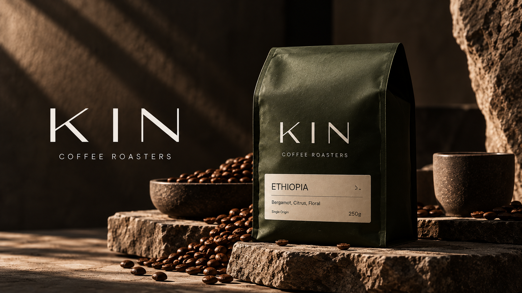
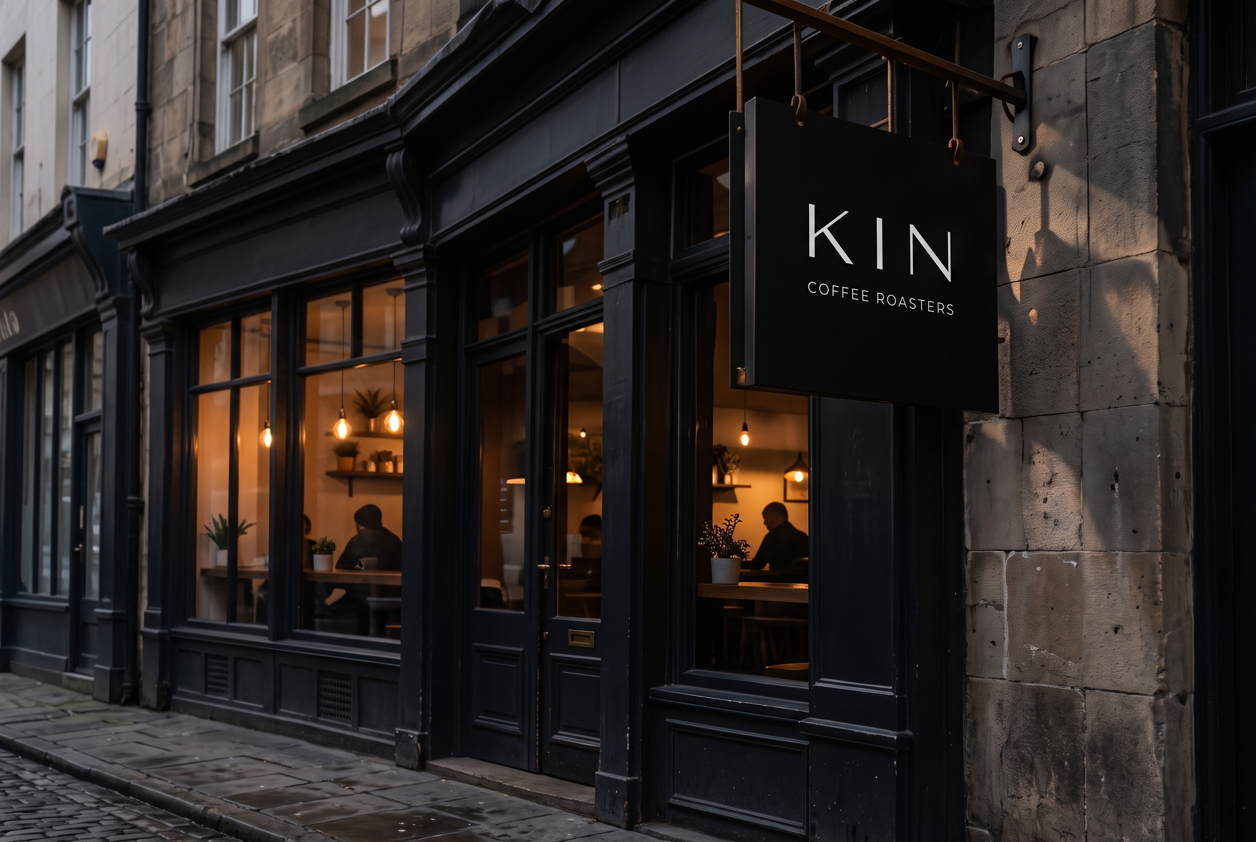
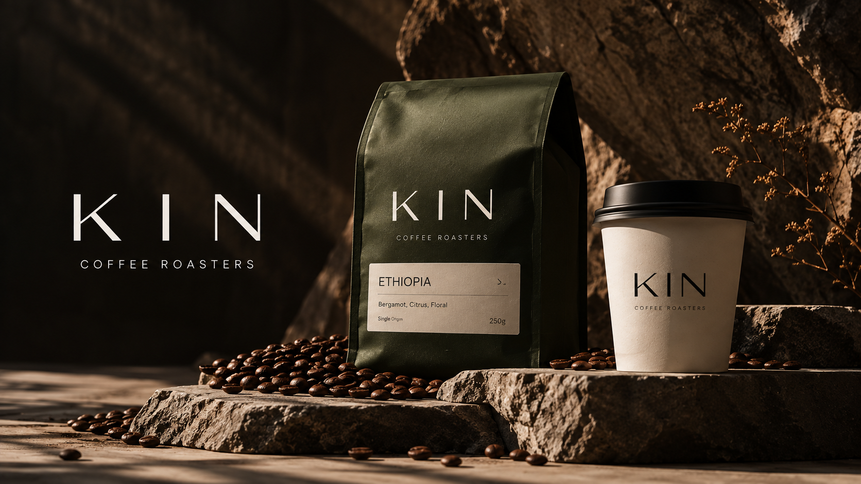
KIN roasts in small batches for people who read the label. The identity is built for two distances: a wide, open wordmark for signs and cups, and a disciplined label system for origin, process and tasting notes on every bag.
What we made
- Wordmark and signage
- Bag and label system
- Cups and takeaway
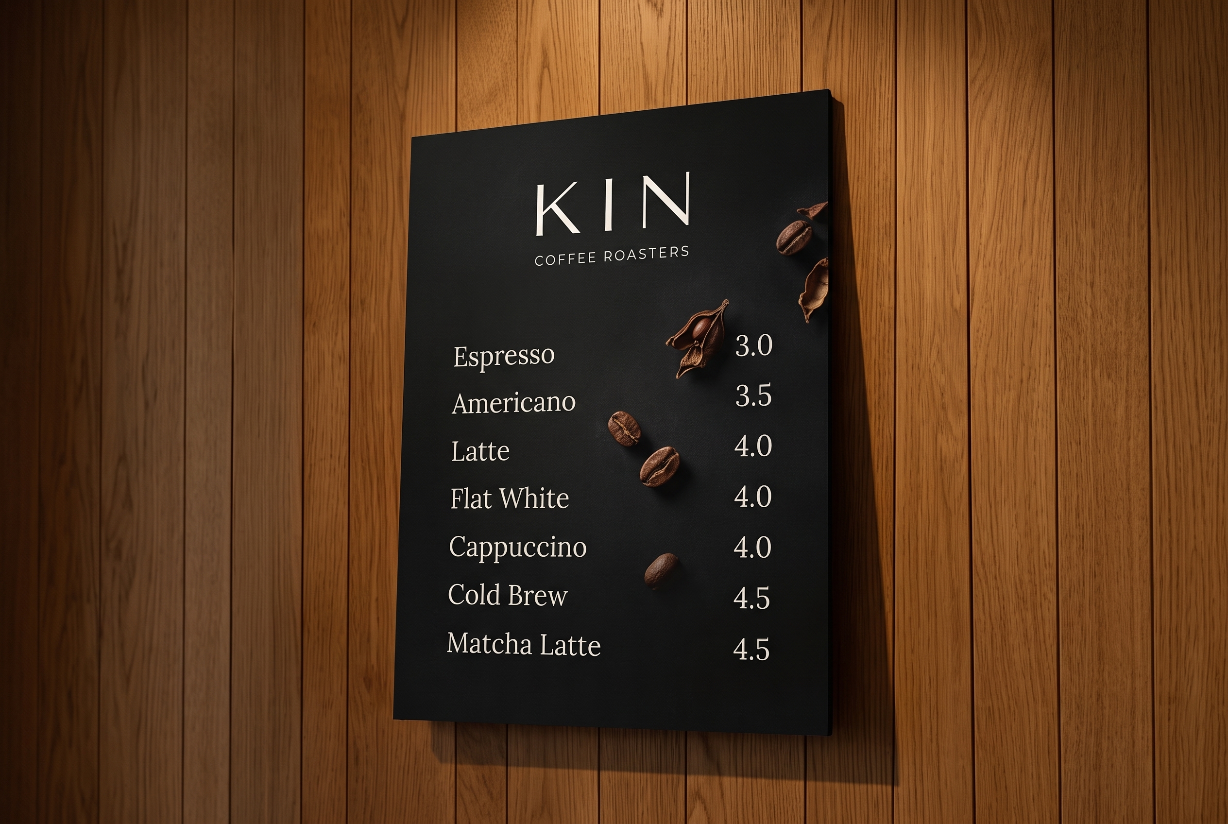
- Menu boards
- Gift boxes and cards
- Totes and merchandise
How we built it
- 01
A label hierarchy agreed with the roasters: origin first, tasting notes last.
- 02
Forest green and warm kraft tones taken from the roastery itself.
- 03
Every item mocked up at full size before print, from the cup to the street sign.
The identity in use