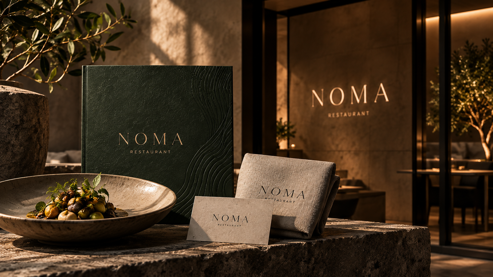
At NOMA, guests spend two or three hours at the table and a few seconds looking at the sign. So we designed the table first.
Texture instead of colour
The wordmark is debossed into the menus, embossed into the plates and stitched into the linen. In candlelight it appears and disappears as the light moves, which suits a room that is meant to feel calm.
A menu that changes weekly
The kitchen changes the menu every week, so the layout had to be something the team could set themselves in minutes. It uses one typeface, two sizes and no rules at all.
Lit by the room
All of NOMA’s photography is shot during service, lit only by candles and the pass. It is harder to shoot and entirely honest about what dinner there actually looks like.