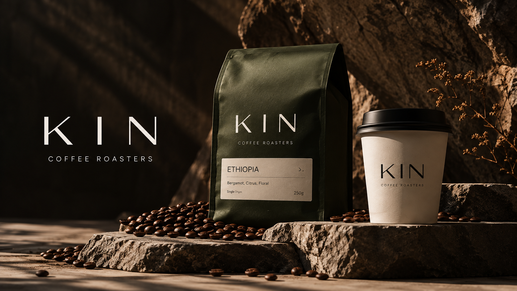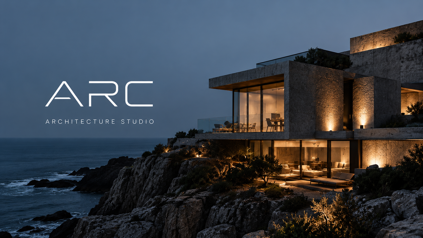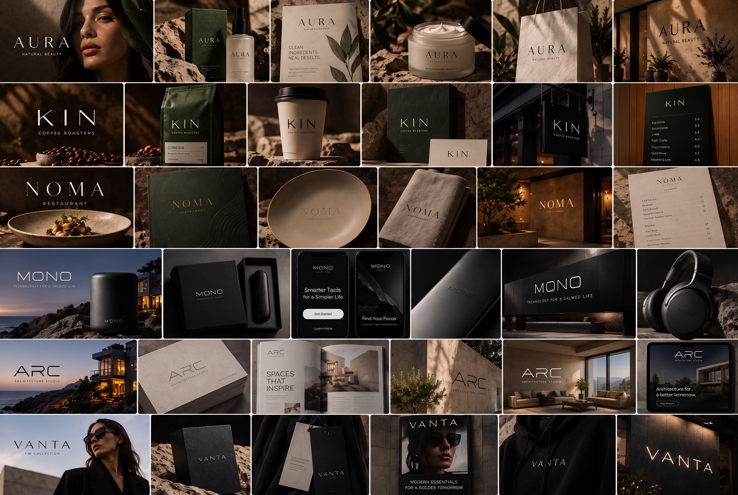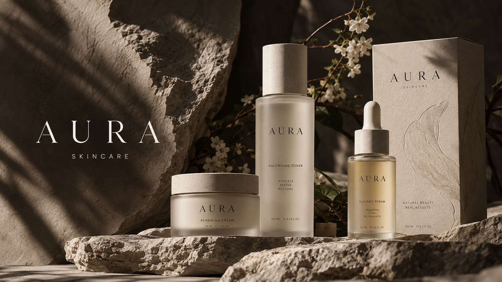
AURA’s green took eleven rounds of print proofs to settle. It needed to feel alive in daylight and almost disappear in the evening, which is harder to specify than it sounds.
Why not black
The founders wanted the calm of black packaging without its severity. A deep green keeps that calm but warms up in natural light, and it sits beside the leaf and stone of the product photography without fighting it.
Proofing on the real stock
Colour on screen tells you almost nothing about colour on uncoated card. Every round was proofed on the final board, under shop lighting and at a window, because the shelf is where the colour has to work.
Writing it down
The finished guidelines specify the green three ways: for uncoated print, coated print and screen. Each one looks slightly different on paper and identical to the eye, which is the whole point.