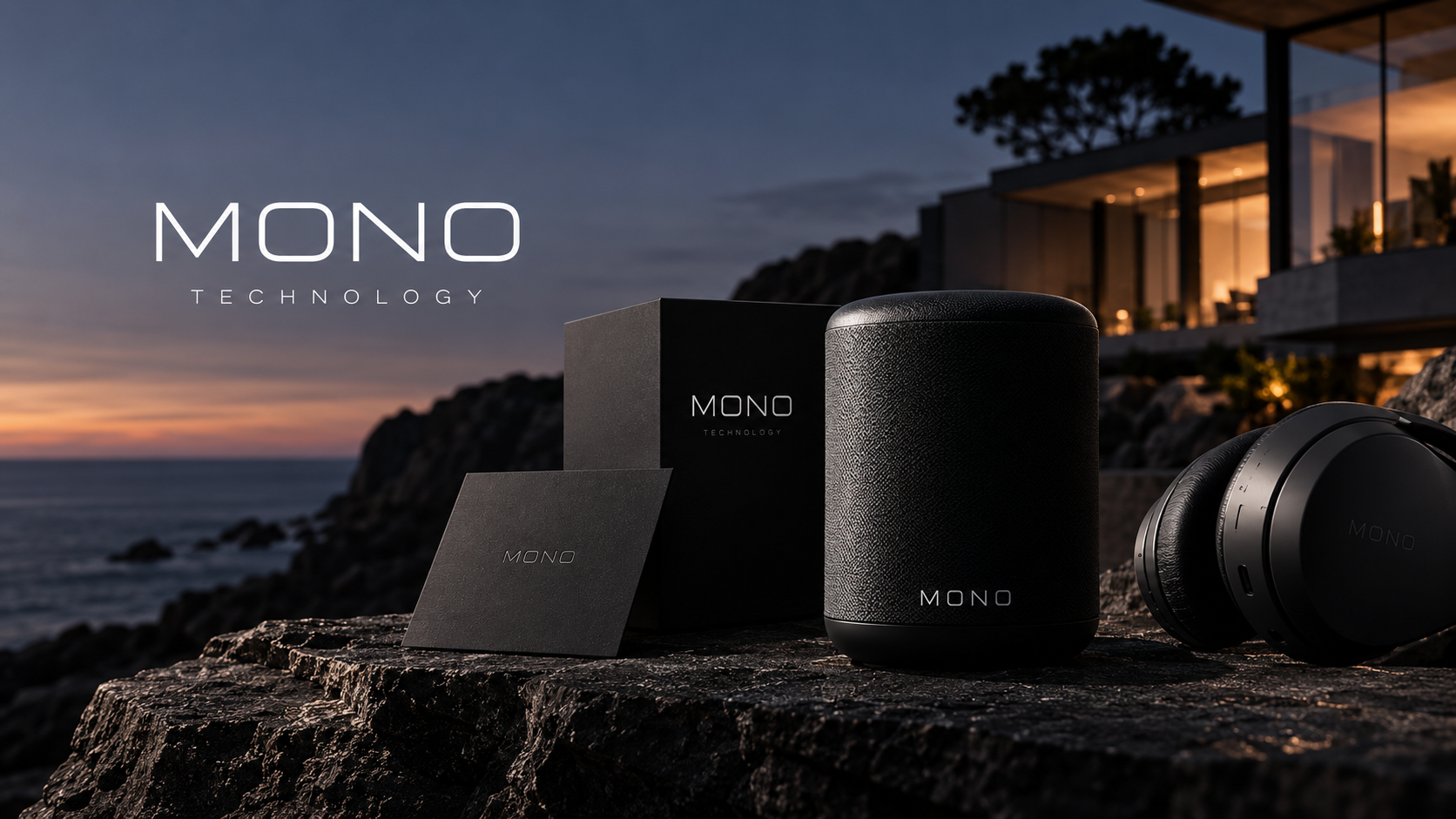
MONO makes objects designed to be noticed less. The app had to follow the same idea, which meant removing most of what apps usually do to hold your attention.
One thing per screen
Every screen in the app has a single job and a single button. Settings live one level down, and the home screen shows only what is playing and where.
Monochrome by rule
The interface uses the same black, grey and off-white as the products. There are no accent colours, so status is shown through weight and position rather than colour.
Motion that settles
Transitions are slow and short, easing to rest rather than bouncing. The app should feel like closing a well-made drawer, and never like a notification.